Case study
Classic Orchestra Portfolio
DESCRIPTION:
Portfolio and concert archive website for a classic orchestra
Client:
Orchestra Filarmonica Pucciniana
FEATURES:
- #WebDesign
- #OfficialWebsite
- #ConcertArchive
Intro
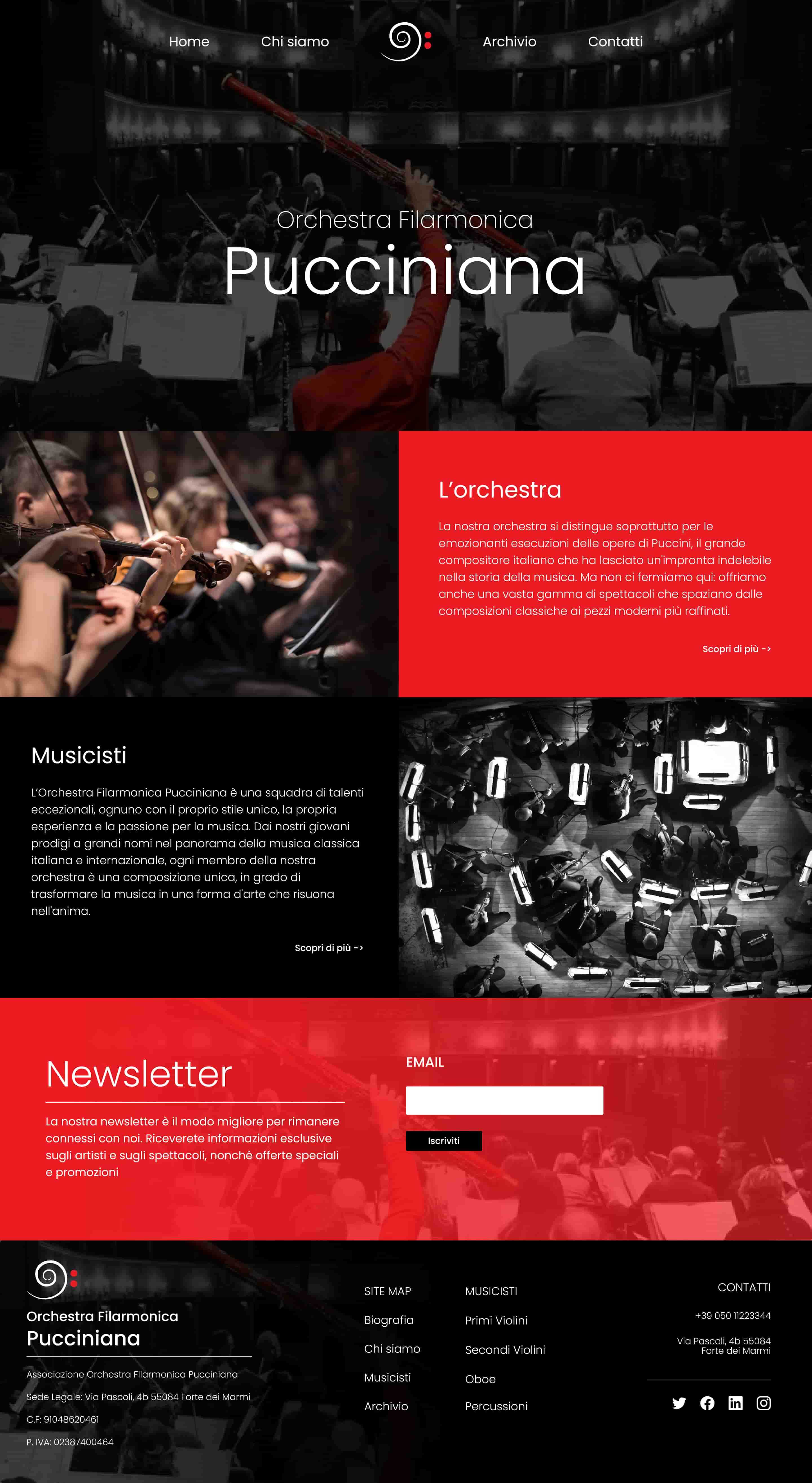
Orchestra Filarmonica Pucciniana is a classic orchestra association that mainly focuses on executing Giacomo Puccini's works and masterpieces. They approached me with the task of building their website from scratch. They wanted a digital product that functioned as an official website and showcased all their works, events and concerts.
The primary objective was to create a modern and aesthetically pleasing website that showed their passion for music and their legacy in the industry. In this case study, I will walk you through my process of designing and developing the website, with a focus on the archive section, and the solutions I provided to meet the client's requirements.
Concept
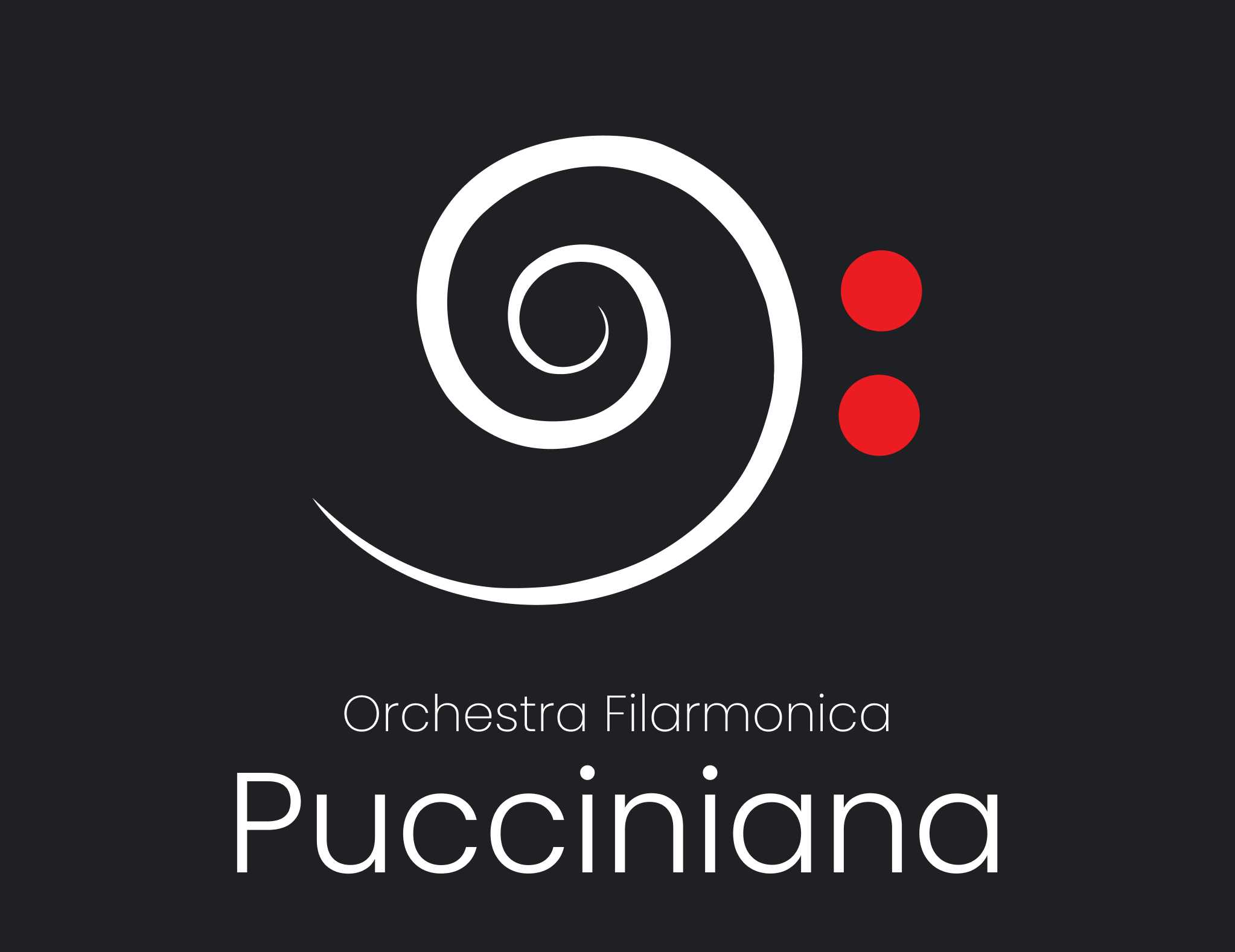
The concept for the website design was to create a modern yet classical feel that reflects the genre of the music that the orchestra executes. The website was designed from scratch, starting with the logo. The spiral logo, which conveys a bass clef, was a metaphorical representation of including music graphical elements and aesthetics. The color theme used was black and red, representing passion, theater, and classic aesthetics. To enhance the immersive experience for visitors, I incorporated a theater curtain animation to the website. This feature gave the website a unique feel and highlighted the orchestra's passion for music. The website was designed to be responsive, ensuring that users could access it from any device.
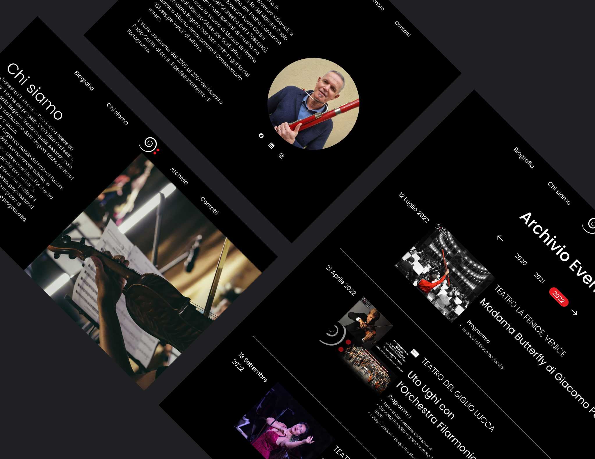
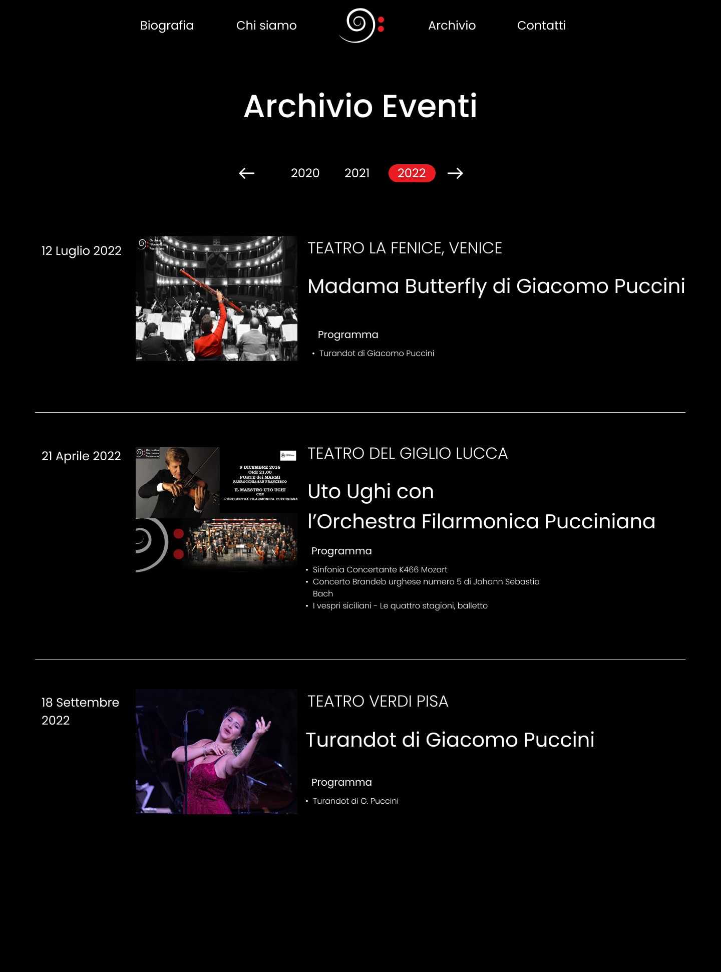
The archive section was one of the critical features of the website. It was designed to showcase all their concerts, events, and participations, grouped by year. This section was carefully designed, keeping in mind the orchestra's legacy and musical. Each event was highlighted with a high-quality photo and a brief description (place, date, title and list of musical pieces), giving users an insight into the orchestra's performances.
"As a Classic Orchestra we wanted a website that truly captured
the essence of our art form yet showed all our activity we’ve done so far.
Working with Michael on the creation of our website was a truly
collaborative and inspiring experience.
He not only understood our vision, but also brought it to
life with stunning design and technical expertise.
From the initial consultation to the final touches, he was always available and responsive to our needs. His technical and design expertise was apparent from the start, and he guided us through the process with patience and professionalism. We appreciated his attention to detail and their willingness to go above and beyond to ensure that our website was exactly what we wanted.
"
"As a Classic Orchestra we wanted a website that truly captured the essence of our art form yet showed all our activity we’ve done so far. Working with Michael on the creation of our website was a truly collaborative and inspiring experience. He not only understood our vision, but also brought it to life with stunning design and technical expertise. From the initial consultation to the final touches, he was always available and responsive to our needs. His technical and design expertise was apparent from the start, and he guided us through the process with patience and professionalism. We appreciated his attention to detail and their willingness to go above and beyond to ensure that our website was exactly what we wanted. "
Selvaggia Schiavi @ Orchestra Filarmonica Pucciniana
Solution
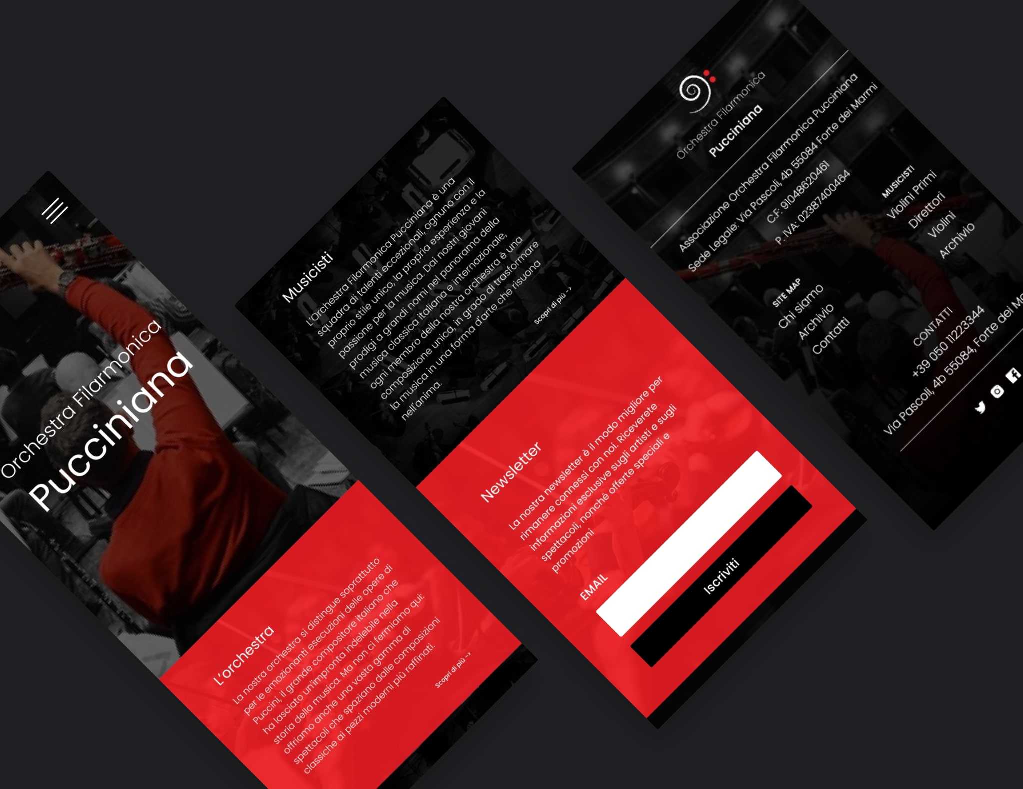
The website was designed and developed from scratch, meeting all the client's requirements, which included an official website, an archive section, an about section, a list of all the musicians, and a newsletter and contact form. The about section showcased all the founder members and the president, with a detailed page for each founder. The website also had a section listing all the musicians. To add to the classical aesthetics of the website, I incorporated photos of the orchestra, which were carefully selected to reflect the passion of the musicians and the beauty of the instruments. The website was designed to be mobile and tablet-friendly, ensuring that users could access it from any device. The newsletter and contact form were strategically placed on the homepage and contact page, respectively. This was to ensure that visitors could easily subscribe to the orchestra's newsletter and contact them for any inquiries. The theater curtain animation was incorporated to make the website's experience more immersive for visitors.
The archive section of the website is an important feature that showcases the Orchestra's extensive history of concerts, events, and participations throughout the years. It is easily accessible from the main menu and is sorted by year, allowing visitors to easily navigate and explore the Orchestra's past performances. Each entry features a photo or video, a brief description of the event, and information about the venue, date, and performers. It adds a sense of authenticity and professionalism to the website and provides a valuable resource for fans and music enthusiasts.
In conclusion, building Orchestra Filarmonica Pucciniana's website was a challenging yet rewarding task. The website reflects their passion for music and their legacy in executing Giacomo Puccini's works. The website design was modern yet classical, giving users an immersive experience. It was an exciting project to work on, and I am proud of the end result.
"We cannot express enough how pleased we are with the final product that Michael delivered. As musicians, we understand the importance of attention to detail and technical expertise.
His dedication, expertise, and professionalism were evident in every aspect of the project, and we felt confident and supported every step of the way. He took our vision and made it a reality, going above and beyond to ensure that the final product was flawless. We would recommend them to anyone in need of exceptional web design services."
"We cannot express enough how pleased we are with the final product that Michael delivered. As musicians, we understand the importance of attention to detail and technical expertise. His dedication, expertise, and professionalism were evident in every aspect of the project, and we felt confident and supported every step of the way. He took our vision and made it a reality, going above and beyond to ensure that the final product was flawless. We would recommend them to anyone in need of exceptional web design services."