Case study
Woman Trainer Academy
DESCRIPTION:
Landing Page Design for a Women Fitness Academy
Client:
WTA
FEATURES:
- #Graphic Design
- #Landing Page Design
- #Figma

Intro
In the world of fitness, WTA Fitness Academy (WTA) shines as a beacon for budding personal trainers. It's all about helping them kickstart their entrepreneurial journey. With a strong focus on comprehensive courses and valuable resources, WTA uniquely caters to women's fitness. Now, picture this: WTA is based in northeast Italy, with its headquarters nestled in the vibrant cities of Venice and Padua. It's got that charming Italian vibe.
Our recent collaboration with WTA's Marketing Officer had a clear mission: jazz up their online presence. How? By cooking up some killer graphics and designing an irresistible landing page mockup. This case study spills the beans on how we seamlessly blended good looks with purpose. Quick heads up: we'll be discreet about client names and spill the tea on graphics and UI choices.


Concept
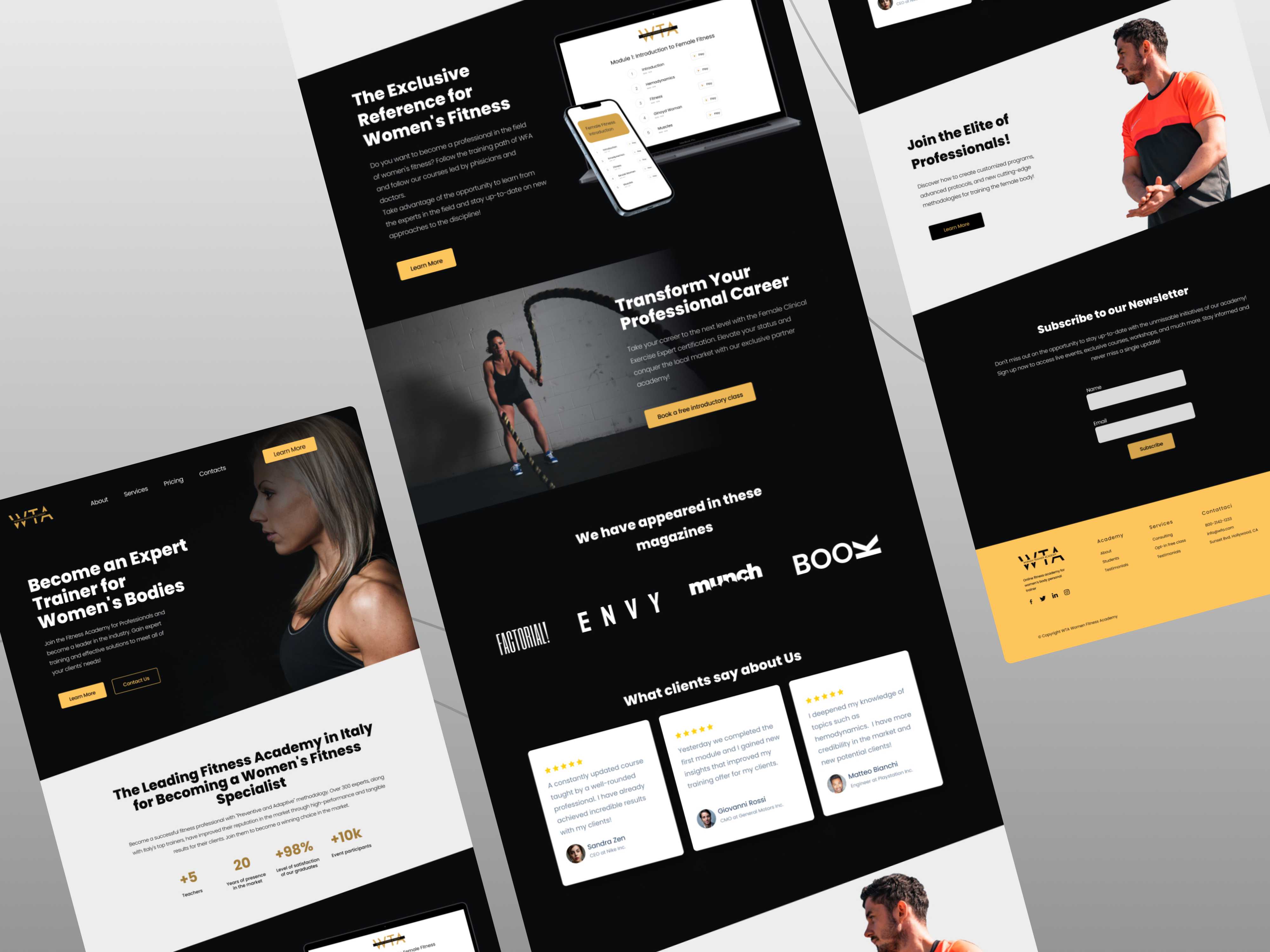
At the heart of the WTA Fitness Academy's website reimagining lies a design concept that seamlessly marries aesthetics with purpose. Drawing inspiration from the Academy's mission to empower personal trainers and their clients, our concept centers around a harmonious fusion of colors, typography, and visuals that encapsulate WTA's ethos.
The color palette forms the foundation of the design, embracing a sophisticated blend of gold, black, and white. Gold symbolizes achievement and excellence, reflecting the Academy's commitment to delivering top-tier fitness education. Black exudes strength and authority, highlighting WTA's leadership in the industry, while white signifies purity and openness, echoing the Academy's transparent approach. This refined palette not only conveys a sense of prestige but also aligns with the fitness journey as one of dedication, resilience, and transformation.
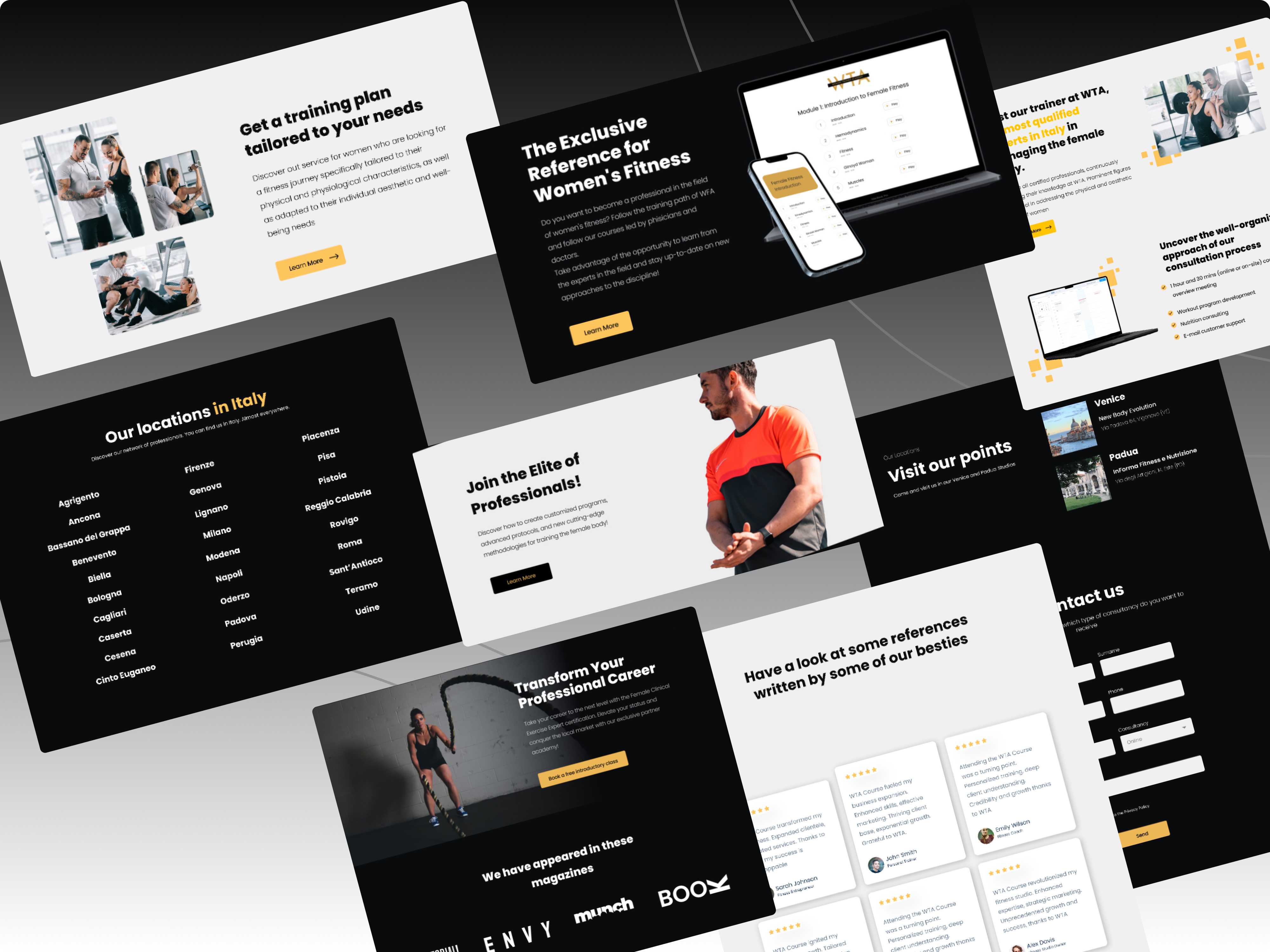
The choice of the Poppins font aligns with WTA's contemporary spirit. Its clean lines and readability ensure a smooth user experience, while its modern aesthetic complements the fitness world's dynamic nature. Our creative narrative unfolds through a harmonious interplay between fitness photography and abstract graphics. High-quality images of trainers and clients in action capture the essence of determination and triumph, resonating with those embarking on their fitness journey. Complementing these visuals are abstract graphics that symbolize the intricate balance between discipline and innovation, mirroring WTA's approach to training.
"During the process of creating the WTA new look, I meticulously followed a structured design process. Beginning with the Brief, I immersed myself in comprehending WTA's core values. The assembly of the Moodboard intricately interwove gold, black, and white, synthesizing sophistication and the dynamic energy of fitness. The Wireframes phase meticulously charted the user journey, ensuring a seamless experience. In the Design HiFi stage, concepts were transmuted into tangible visuals, a fusion of typography, imagery, and graphics that embodied WTA's ethos. This process, from Brief to Design HiFi, ultimately culminated in a website that not only reflects WTA's essence but also invigorates its digital presence, inspiring trainers and clients alike"
"During the process of creating the WTA new look, I meticulously followed a structured design process. Beginning with the Brief, I immersed myself in comprehending WTA's core values. The assembly of the Moodboard intricately interwove gold, black, and white, synthesizing sophistication and the dynamic energy of fitness. The Wireframes phase meticulously charted the user journey, ensuring a seamless experience. In the Design HiFi stage, concepts were transmuted into tangible visuals, a fusion of typography, imagery, and graphics that embodied WTA's ethos. This process, from Brief to Design HiFi, ultimately culminated in a website that not only reflects WTA's essence but also invigorates its digital presence, inspiring trainers and clients alike"
Michael Web Creation
Solution
My solution for the WTA Fitness Academy's website redesign is a comprehensive and immersive approach that elevates user experience while aligning with the Academy's vision. Through meticulous design decisions and strategic structuring, we've crafted an engaging online platform that mirrors the vitality and dedication of the fitness realm.
Building on the elegant palette and typography, our solution begins with a Stunning Hero Section that not only captures attention but also communicates the core values of the Academy. The blend of captivating imagery and well-crafted text serves as an inviting gateway, encouraging users to delve deeper into the site's offerings.
I've strategically organized the site into feature sections that spotlight WTA's core aspects: the program, nutrition insights, and the Academy's app. Each section seamlessly integrates creative mockup designs that provide an interactive preview of what awaits. This user-centric approach ensures that visitors can effortlessly explore and understand the Academy's offerings, fostering a sense of connection and motivation.

"Michael is an exceptionally talented web developer and UX/UI designer. He created high-quality assets for my project, including designs for the landing page, logo branding, and various sections of the website. What sets him apart is his ability to bring my vision to life exactly as I had imagined. If you have a concept in your mind that you're looking to materialize, he is the perfect choice. Furthermore, he provided invaluable assistance from the project's inception to its completion. Working with Michael has led to the establishment of a long-term collaborative relationship. I highly recommend his services!"
"Michael is an exceptionally talented web developer and UX/UI designer. He created high-quality assets for my project, including designs for the landing page, logo branding, and various sections of the website. What sets him apart is his ability to bring my vision to life exactly as I had imagined. If you have a concept in your mind that you're looking to materialize, he is the perfect choice. Furthermore, he provided invaluable assistance from the project's inception to its completion. Working with Michael has led to the establishment of a long-term collaborative relationship. I highly recommend his services!"